The best watches at the Venice Film Festival deserve to be judged in the context of the clothes, gestures, and photographs that give them their impact. Our editorial preference is simple: a memorable watch should contribute something specific to an appearance. It might sharpen a sleeve’s clean lines, introduce an unexpected texture, or supply the one eccentric detail that makes formalwear feel personal.
That makes festival wristwear an engaging subject for film lovers. Looking closely at a watch exercises some of the same attention we bring to costume and composition on screen. Shape, scale, placement, and contrast all influence what we notice. This is a critical guide to those visual choices, rather than an inventory of identified watches or a verdict on the films being promoted.
Start with the whole appearance
A watch photographed alone and a watch worn with evening clothes present different visual problems. In isolation, an intricate dial can command attention through sheer density. Against a shirt, jacket, rings, and other accessories, the same detail may become difficult to read. Conversely, a plain dial that seems unremarkable in a product photograph can provide a beautifully clear accent on the wrist.
Our first test is to look at the full outfit before examining the watch. Where does the eye travel? Does the metal repeat a detail elsewhere, or introduce a useful contrast? Does the case sit comfortably within the exposed space between sleeve and hand? These questions establish what the accessory actually contributes.
This approach develops the attention to silhouette discussed in our guide to reading festival style through framing and proportion. A detail earns its place through its relationship with everything around it. Recognizing the maker is a separate pleasure.
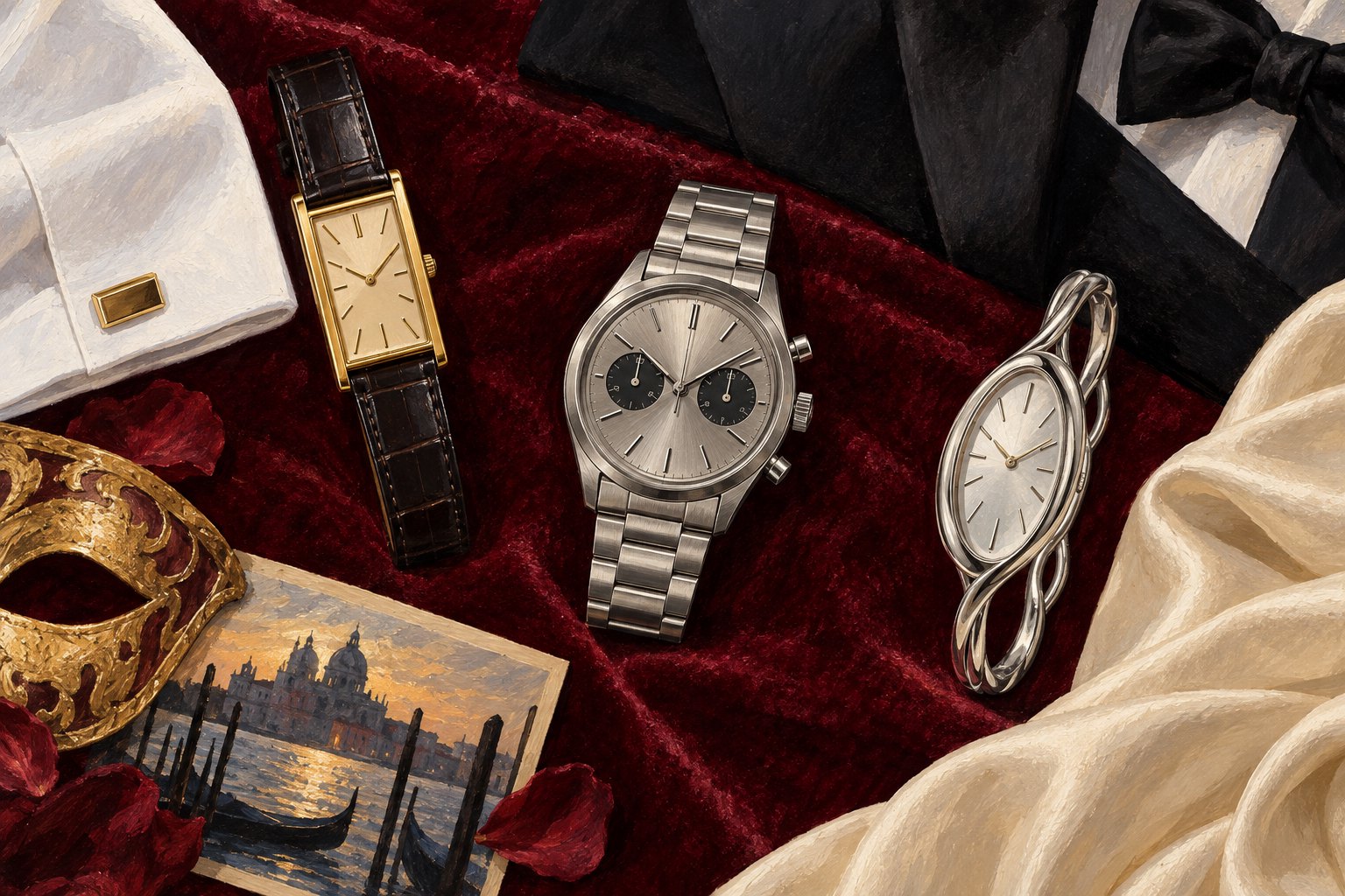
Three watch styles, three different visual effects
The restrained dress watch: continuity
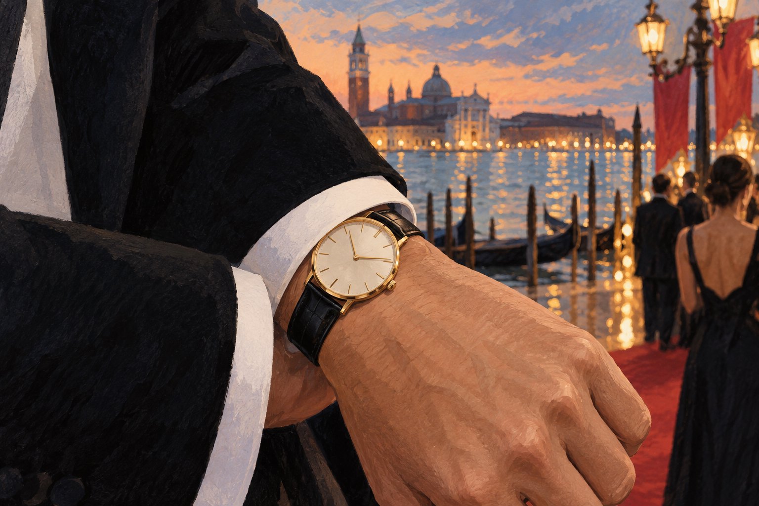
A slim watch on a dark strap can extend the controlled lines of formal tailoring. The strap offers a visual connection to dark fabric; the case supplies a small interruption of light. A rectangular shape can echo the geometry of a cuff, while a round case can soften it. Neither shape guarantees elegance. The useful question is whether its dimensions suit the surrounding space.
We find this approach most effective when restraint remains visible in the details. A case that slips beneath the cuff allows the watch to appear through movement. It becomes something the viewer discovers. That delayed recognition has its own appeal: the accessory rewards attention without requiring the entire appearance to revolve around it.
The sports watch: deliberate contrast
A substantial bracelet, broad bezel, or dial with multiple registers creates a different rhythm. These elements can make formal clothes feel less ceremonious. The visual interest lies in the meeting of an object associated with activity and an outfit arranged for a public occasion.
The challenge is proportion. If the watch pushes against the sleeve or visually overwhelms the hand, the contrast can look unresolved. If its scale works with the tailoring, the combination can feel relaxed and convincing. Our preference is for contrast with a clear purpose: one assertive object often communicates more than several accessories competing for the same attention.
The jewelry watch: sculptural emphasis
A watch can also function primarily as a piece of sculpture. An unusual case, decorative bracelet, or flowing outline may matter more to the appearance than the dial. Here, the strongest question is how the object relates to the wearer’s other shapes: a curved lapel, a sharp shoulder, a soft sleeve.
For our taste, a sculptural watch works especially well when there is enough visual space around it to appreciate its outline. Elaborate clothing can support elaborate accessories, too, but the relationship needs to remain legible. Complexity alone does not create a compelling composition.
What a close-up reveals—and what it conceals
A tight crop is useful for studying a watch’s surface. It can reveal the contrast between a polished edge and a brushed section, the spacing of dial elements, or the way a strap meets its case. Those details explain why an object remains interesting after the first glance.
But a close-up also changes emphasis. By removing the rest of the outfit, it makes the watch the dominant subject automatically. That is a photographic decision, not proof that the watch dominated the appearance in person. An accessory can be fascinating under magnification and almost invisible at conversational distance.
Film viewers already understand this distinction. A close-up asks us to notice something; a wider frame shows its relationship to the scene. Apply the same discipline to festival photographs. Move between detail and context before deciding whether a watch was beautifully integrated, deliberately disruptive, or simply photogenic on its own.
A watch can suggest character without explaining a person
On screen, an accessory can gain meaning through repeated actions. A character might protect an object, hide it, give it away, or check it compulsively. Those actions would provide evidence for interpretation. A single photograph offers much less narrative information.
It is tempting to describe an understated watch as proof of humility, or an extravagant one as evidence of vanity. Those judgments mistake visual associations for knowledge of a person. More precise criticism describes the effect: understated, theatrical, severe, playful. It leaves private motives open.
That distinction also matters when considering the presentation surrounding a Venice appearance. Clothing and accessories help construct a public image. Understanding their visual language can deepen our interest in that image without turning it into a character diagnosis.
A practical way to choose your own favorites
You do not need technical specifications or price estimates to make a thoughtful aesthetic judgment. Try a consistent sequence when comparing festival looks:
- Read the silhouette. Notice the clothing’s overall shape before zooming toward the wrist.
- Check the fit. Look at how the case, strap, or bracelet occupies the space around the cuff and hand.
- Follow the light. Decide whether reflective surfaces complement the outfit or distract from its strongest features.
- Name the contribution. Identify what the watch adds: continuity, contrast, color, texture, or sculptural interest.
- Return to the full image. Confirm that the detail still works when it stops filling the frame.
This produces more useful criticism than calling every recognizable luxury object a standout. It also accommodates different tastes. Someone who values composure may favor a discreet watch; someone drawn to expressive costume may prefer a stranger silhouette. Both judgments become persuasive when supported by specific observations.
The small detail and the larger spectacle
For us, the most rewarding Venice watch commentary treats attention as something to examine. Why did this object catch the eye? Was it the design, its placement, a gesture, or the photograph’s framing? Asking those questions makes the experience richer than simply identifying a coveted possession.
The deeper connection to cinema is our willingness to look again. A small object can change how we read a larger image, yet its meaning depends on what surrounds it. The most compelling festival watch is the one whose contribution becomes clearer on that second look: a carefully judged detail that makes the whole appearance more interesting.
Original content by this site's editorial team. Published: September 16, 2026 at 00:07:44 PDT (Los Angeles time)