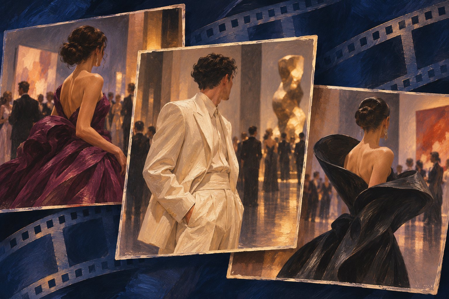
The celebrity looks from the 2026 LACMA Art+Film Gala offer an invitation to browse, compare, and choose favorites. Harper’s BAZAAR has devoted a gallery to the evening’s appearances. But there is another way to approach that parade of photographs: pay attention to how the pictures become a sequence. The outfit belongs to the guest; the experience of encountering it also belongs to the edit.
For movie lovers, that distinction is familiar. A shot acquires meaning from its duration, its framing, and the image beside it. A red carpet gallery operates differently from a film, yet it poses a related question: how much of our reaction comes from what we see, and how much comes from how we are shown it?
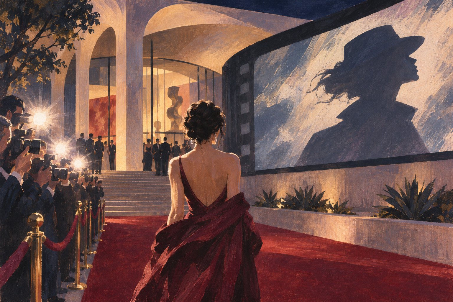
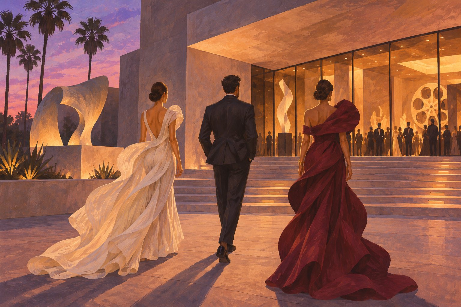
This is a commentary on viewing and presentation, rather than a comprehensive outfit inventory or a best-dressed ranking. Its interest lies in the visual storytelling around the gala’s celebrity looks. The accompanying illustrations are conceptual scenes featuring fictional guests, not photographs of the event.
The opening image becomes an opening scene
The first photograph in a gallery does more than introduce one outfit. It gives the viewer a starting expectation. A close portrait invites attention to expression and detail. A full-length image encourages us to consider the complete ensemble. A wider photograph makes the setting part of the experience.
Imagine opening a gallery with an expansive evening gown, then imagine opening the same collection with restrained tailoring. Without changing the guest list, the two versions could suggest different moods. One might initially feel theatrical, the other composed. These are hypothetical examples, not descriptions of particular outfits at this year’s gala.
That is why I would resist reading opening placement as an automatic declaration of importance. The opening image can serve many purposes, and its position alone does not establish the editor’s intention. What it certainly does is arrive before the others, when the viewer has the fewest comparisons available.
Neighboring photographs create visual arguments
In film editing, a cut can invite viewers to connect images that were recorded separately. A fashion gallery creates a quieter version of that relationship. Put two similar colors together and repetition becomes noticeable. Place a highly embellished look beside an understated one and contrast becomes the story.
Neither comparison requires the guests to have coordinated anything. The relationship can exist entirely in the presentation. That distinction matters when discussing the LACMA gala: a sequence of photographs may suggest harmony, rivalry, or a shared mood without providing evidence of anyone’s intentions.
A useful viewing exercise is to return to a favorite photograph after looking at several others. Does it feel different now? Perhaps something that initially looked understated seems decisive after a run of busy images. Perhaps an apparently startling choice feels less unusual once similar approaches appear. The photograph has stayed still; your frame of reference has changed.
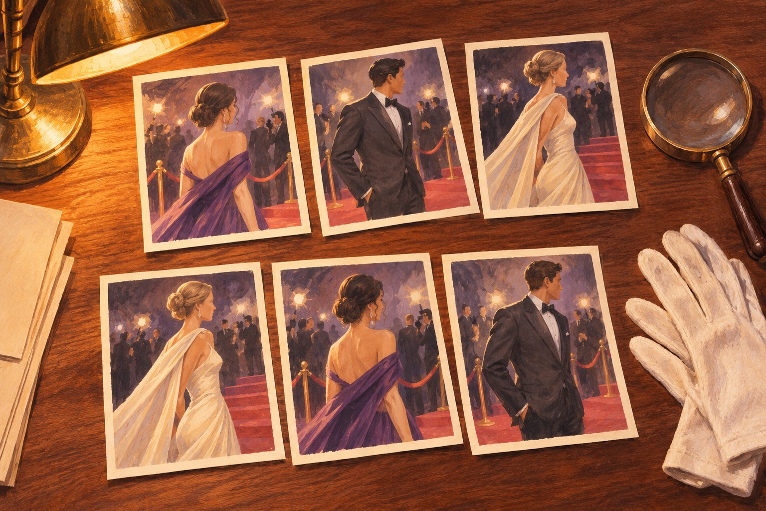
A crop changes the question you are answering
A portrait and a full-length photograph are not interchangeable evidence. The portrait can reveal an accessory or the relationship between a neckline and a hairstyle. The wider view can show how individual elements belong to the whole. Each has value, but each leaves something outside the frame.
This becomes especially relevant when making comparisons. A tightly cropped image of one guest and a distant photograph of another give the viewer different amounts of information. Declaring one outfit more cohesive on that basis may say as much about the available pictures as about the styling.
For a closer discussion of the garments themselves, our guide to what makes a LACMA red carpet look memorable examines visual design. Here, the useful preliminary question is simpler: do the images actually let you make the comparison you want to make?
A gallery has pacing, even without a running time
A movie determines how long a shot remains onscreen. A gallery usually lets the reader decide. Yet presentation still offers cues about speed. Similar compositions can encourage a quick rhythm of scrolling. An unexpected change in scale or a particularly detailed image may invite a pause.
That makes fast browsing and slow looking meaningfully different experiences. During a quick pass, an immediately legible contrast may command attention. On a second pass, smaller decisions can become more rewarding. Neither response is dishonest; they answer different demands.
My preference is to give an image two chances: once in the flow of the gallery and once on its own. The first encounter reveals how readily it attracts attention. The second helps establish whether there is enough visual interest to sustain that attention. A memorable appearance can succeed at either, but the distinction makes criticism more precise.
The crowd does not automatically become a cast
Because this is an Art+Film gala, it is tempting to turn the assembled celebrities into characters in an imaginary movie. A sequence of confident poses can suggest entrances, alliances, or confrontations. Those impressions may be entertaining, but photographs do not supply a screenplay.
A serious reading should distinguish an image’s dramatic effect from claims about the person pictured. A glance captured between poses cannot establish discomfort. Two photographs placed consecutively cannot establish a relationship. A compelling visual association remains an association until reporting supports something more.
Our discussion of the LACMA stars beyond their screen roles considers the pull of familiar performances. Gallery sequencing adds another influence: even after separating an actor from a character, we may still invent a story from the surrounding images.
Three ways to make a better second pass
- Describe before judging. Identify what the photograph emphasizes and what it leaves unseen. This gives your reaction something concrete to rest on.
- Check the comparison. Look for roughly equivalent framing before weighing two appearances against each other. If the images differ substantially, acknowledge that limitation.
- Separate pattern from intention. Repeated colors or related styling choices can be interesting without proving a coordinated theme. Explain the pattern you notice without assigning a motive.
These habits need not turn browsing into homework. They make room for a more satisfying opinion than an instant winner-and-loser verdict. You can still love an extravagant entrance or prefer a quiet ensemble while recognizing how the presentation helped that preference take shape.
The deeper story is how attention gets organized
The 2026 LACMA Art+Film Gala’s celebrity looks sit at a productive meeting point for fashion and film commentary. They invite judgments about individual appearances, but their presentation also raises a cinematic question: what happens when separate images become an experience?
My view is that the richest reading keeps both levels visible. Enjoy the outfit, then notice the framing. Follow the sequence, then revisit the individual photograph. The pleasure of the gallery survives that scrutiny. It becomes more interesting when we recognize that an evening’s visual story is shaped both by the people who step before the camera and by the choices that guide our eyes afterward.
Original content by this site's editorial team. Published: November 7, 2026 at 21:52:25 PST (Los Angeles time)