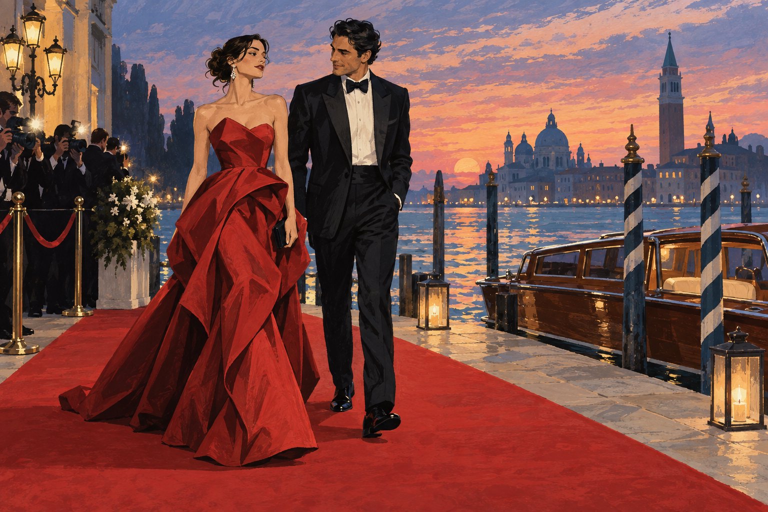
The 2026 Venice Film Festival’s best-look conversation raises a question that belongs comfortably on a movie site: what makes an entrance worth watching? For this critic, a memorable red carpet look brings silhouette, movement, and personality into focus. The clothing gives the eye somewhere to go, while the person wearing it gives the image a reason to matter.
Vogue’s fashion roundup provides the occasion for that discussion. Here, the interest is in the visual language behind the best-look judgment: how an outfit establishes presence, how a photograph shapes our response, and why a star’s appearance can suggest a story before a film begins. This is a spoiler-free critical perspective on festival style, rather than a garment-by-garment verdict.
Start with the silhouette, then look at the person
A useful first test is to look at the whole figure before examining jewelry or embellishment. Where does the outfit place its visual weight? A broad shoulder, narrow column, sweeping skirt, or loose trouser leg directs attention differently. Those proportions establish the basic composition before any individual detail gets its turn.
The comparison with filmmaking is straightforward. A carefully composed shot helps us understand where to look without requiring an explanation. Clothing can organize an image in the same way. An interesting neckline might lead toward the face; an oversized sleeve might interrupt that movement. Either choice can work, depending on the relationship between the parts.
My preference is for looks that reward both distances: recognizable as a shape from across the carpet, then more interesting when the details become visible. An outfit need not be restrained to achieve that balance. Extravagance can be coherent, and minimalism can feel unresolved. The useful question is whether the elements strengthen one another.
Movement is the test a still photograph cannot finish
Film lovers have a particular reason to care about what happens between poses. Clothing changes when someone walks, turns, reaches, or sits. A rigid shape might produce a striking portrait; a softer garment might become compelling only when its folds shift. Neither quality is inherently superior, but they offer different kinds of visual pleasure.
When viewing festival coverage, compare a full-length image with a movement sequence if one is available. Look for how a hem follows the wearer, whether a jacket retains its line, and how the person adjusts their posture. These observations describe the interaction between body and clothing. They do not establish whether someone feels confident, uncomfortable, happy, or annoyed.
That distinction matters. A single photograph can freeze a blink or an awkward transition and make it seem meaningful. Good style criticism should be precise about visible details and modest about private feelings. We can discuss the tension in a pose without inventing the emotional story behind it.
Texture and lighting help create the drama
Surface is another part of the performance. Glossy fabric can produce sharp highlights, while a matte surface can emphasize shape through softer changes in light. Beading, folds, and layered materials introduce additional rhythms. Before calling an outfit busy or simple, consider what the lighting is doing to it.
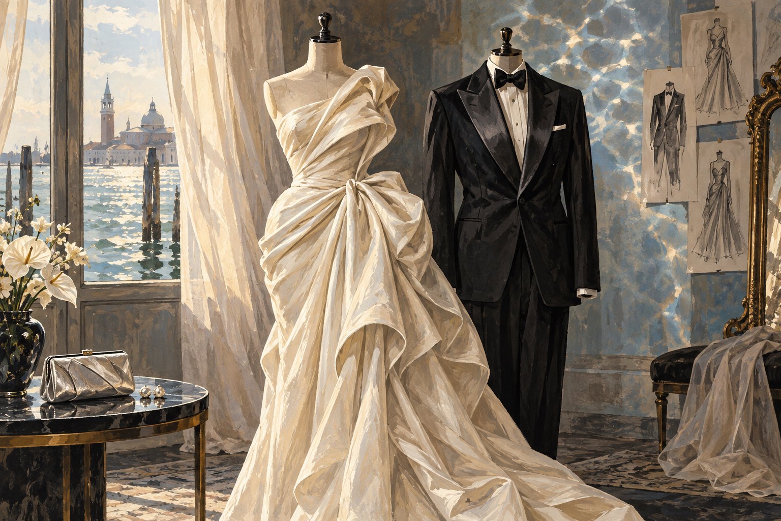
The conceptual illustration above isolates that contrast: draped ivory fabric beside structured dark tailoring. It depicts imagined garments, not documented festival outfits. Its purpose is to make the visual comparison clear. The gown gathers attention through folds and volume; the tuxedo establishes a more geometric framework through its lapels and vertical lines.
A useful judgment identifies the mechanism behind the reaction. Instead of stopping at “glamorous,” ask whether the effect comes from reflected light, proportion, contrast, or ornament. That small adjustment makes fashion commentary more informative—and gives readers something they can agree or disagree with specifically.
A star’s public image is a different kind of character
A red carpet appearance invites interpretation because audiences bring memories with them. Previous performances, familiar gestures, and earlier publicity images can influence how a new appearance reads. A severe silhouette might seem like a departure on one performer and a continuation on another. The garment enters a conversation already underway.
Still, treating a star as a character has limits. A fictional character’s costume can be interpreted alongside scenes, dialogue, and consequences within a finished story. A premiere outfit offers far less evidence. It can suggest an association, but it cannot prove someone’s motives or disclose the meaning of their next performance.
Our discussion of Bunker’s Venice appearance and character-centered drama offers a related route from premiere coverage toward film analysis. The productive move is to let an appearance generate curiosity, then examine the movie through what its characters actually say and do.
What deserves the word “best”?
“Best” is a critical judgment, and a useful one needs criteria. Novelty alone does not settle it. Neither does a recognizable designer name, an expensive-looking finish, or the number of accessories involved. My strongest response is usually to a look with a clear organizing idea and enough individuality to resist becoming anonymous formalwear.
These four questions make that judgment easier to explain:
- Composition: Do the proportions guide attention effectively across the whole look?
- Detail: Do accessories and finishes develop the main idea or compete with it?
- Movement: Does the clothing remain visually interesting beyond the selected pose?
- Presence: Does the image leave room to notice the wearer’s face, gestures, and bearing?
Different viewers will give those qualities different weight. Someone drawn to theatrical scale may favor volume; someone attentive to tailoring may respond to a small adjustment in fit. Explaining that preference creates a better conversation than presenting taste as an objective score.
Let the entrance open the door to the film
The deeper appeal of Venice festival fashion is its promise of transformation. An entrance briefly turns a person, an outfit, a setting, and an audience into a scene. For a film lover, the pleasure lies in recognizing how readily we assemble those elements into a narrative—even when we have only a photograph.
That instinct is worth enjoying and examining. A beautiful premiere image may encourage us to discover a movie, but the movie must eventually supply its own reasons to care. Our guide to reading Venice film reviews beyond the verdicts continues that transition from first impression to closer attention.
For me, the most cinematic red carpet look makes you linger: first over its shape, then over its details, and finally over the person within it. The lasting pleasure comes from that unfolding act of looking.
Original content by this site's editorial team. Published: September 10, 2026 at 02:28:12 PDT (Los Angeles time)